Scorn
Art vs Atmosphere

Game Information
Game Name: Scorn
Platform(s): PC, Xbox Series S/X, PlayStation 5
Developer(s): Ebb Software
Publisher(s): Kepler Interactive
Genres: Puzzles, Horror, Sci-Fi
First Release Date: Oct 14, 2022
Last Update Date: Mar 16, 2023
Description: Scorn is an atmospheric first-person horror adventure game set in a nightmarish universe of odd forms and somber tapestry.
Reviewed On
Hardware: S.T.A.L.K.E.R.
(Radeon RX 6950 XT, AMD Ryzen 7 5800X3D, 32 GB RAM)
Platform: Steam
Review Notes
- None
Art vs Atmosphere
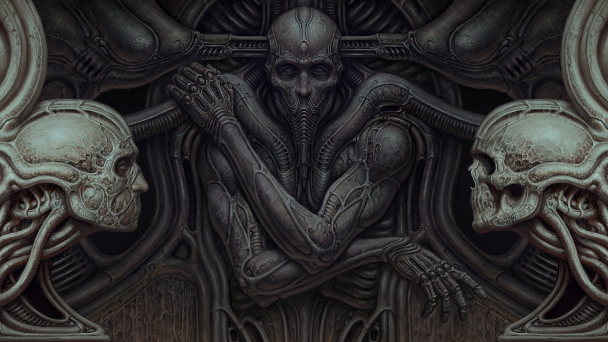
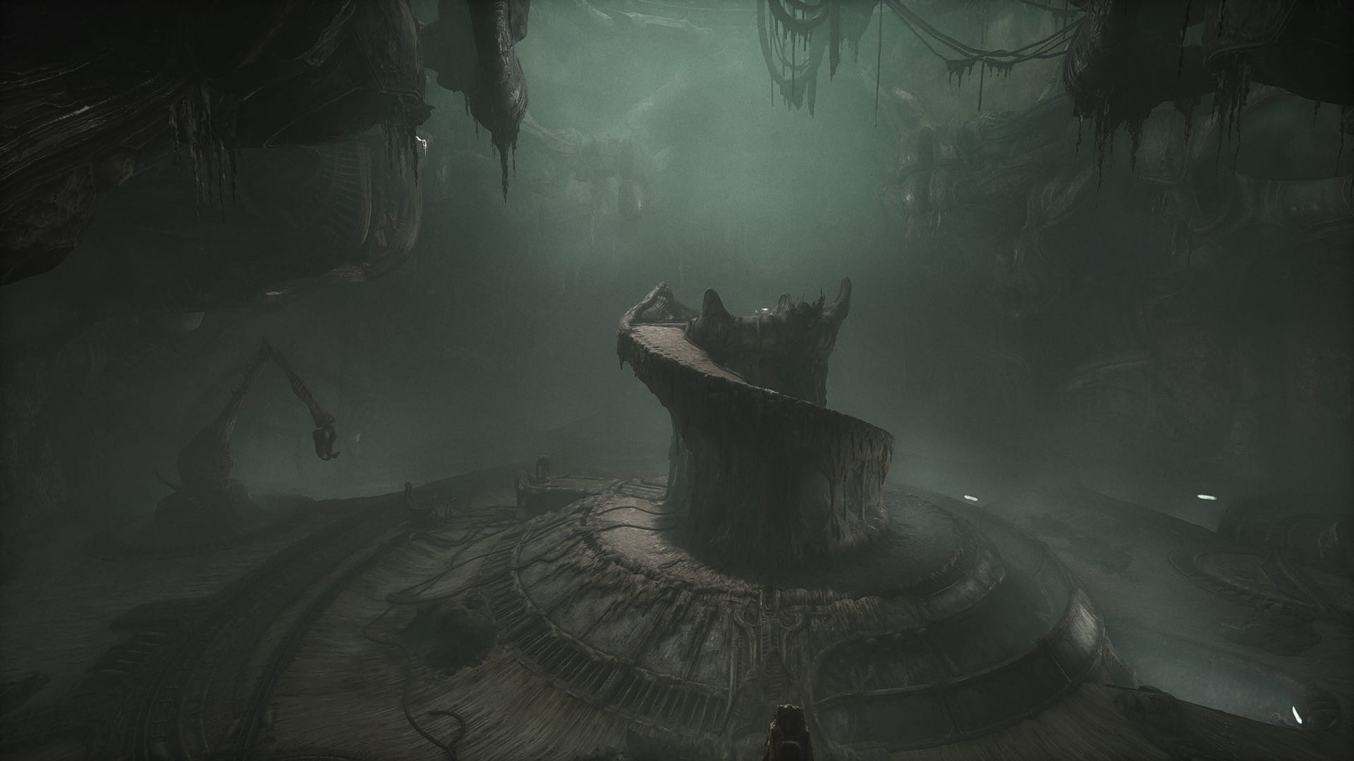
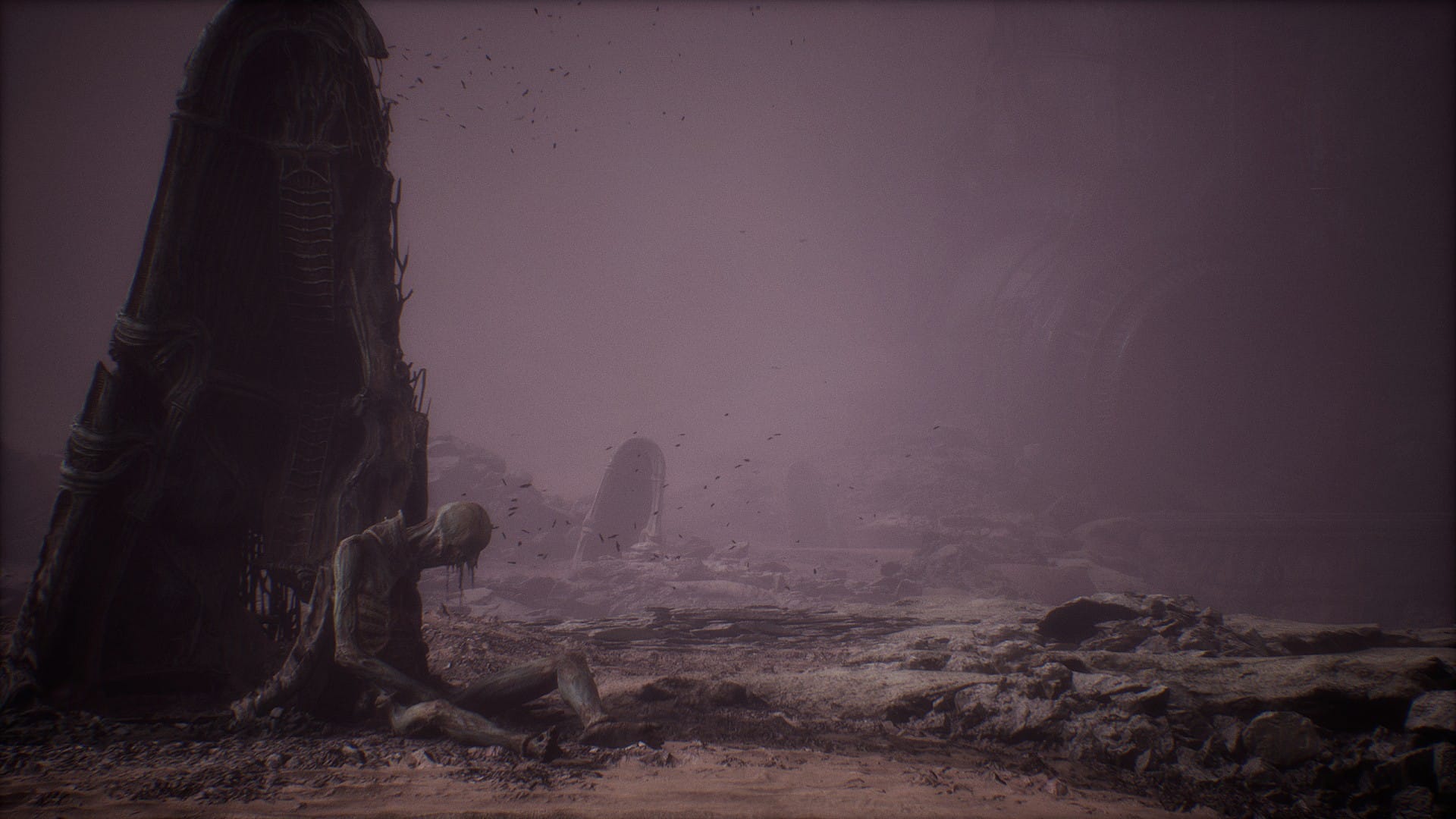
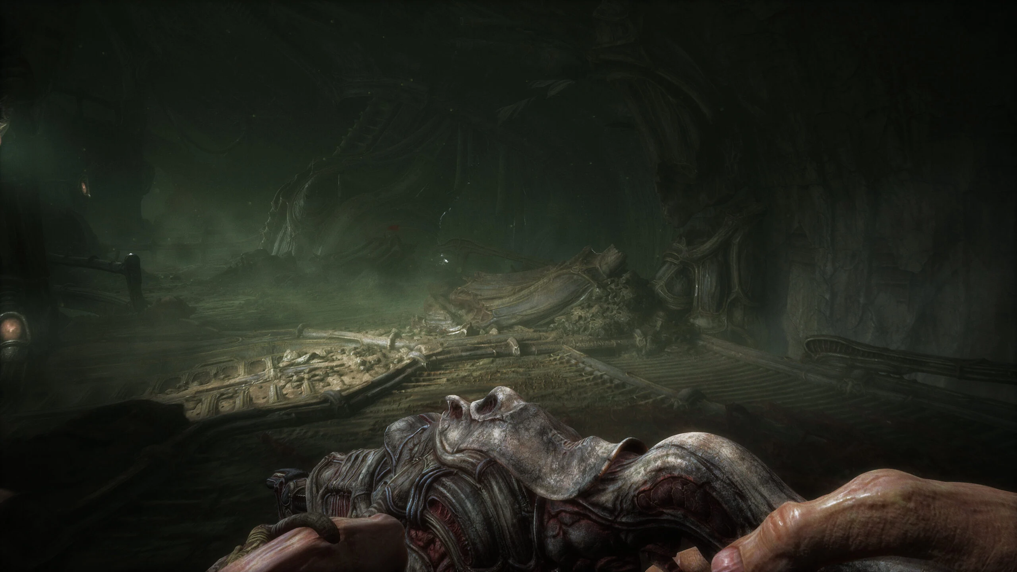
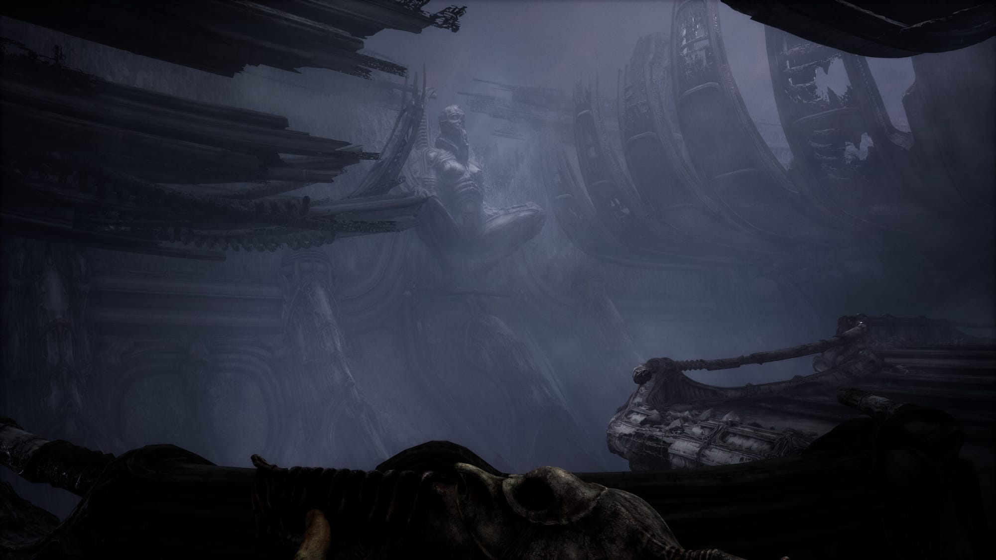
Let's get this out of the way because it's the most obvious observation everyone and their mother makes about Scorn. Yes, the art design of this game is fantastic and pretty unique for video games. The game world is very H.R. Giger inspired. The aesthetics fit alongside a lot of the concept art you can see for Alien and Prometheus. In game your breath is often swept away when coming across massive structures or alien vistas. The scale of some areas combined with the foreign architecture is awe inspiring. I recommend playing this one on a big screen, preferably something that can overwhelm your senses. I'll show some screenshots, but in this case, they really don't do the game justice.

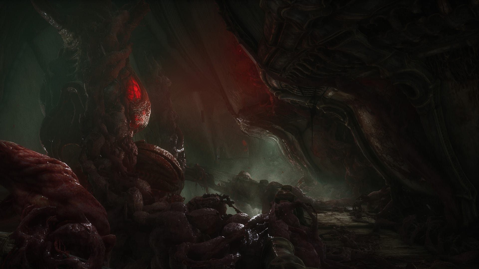
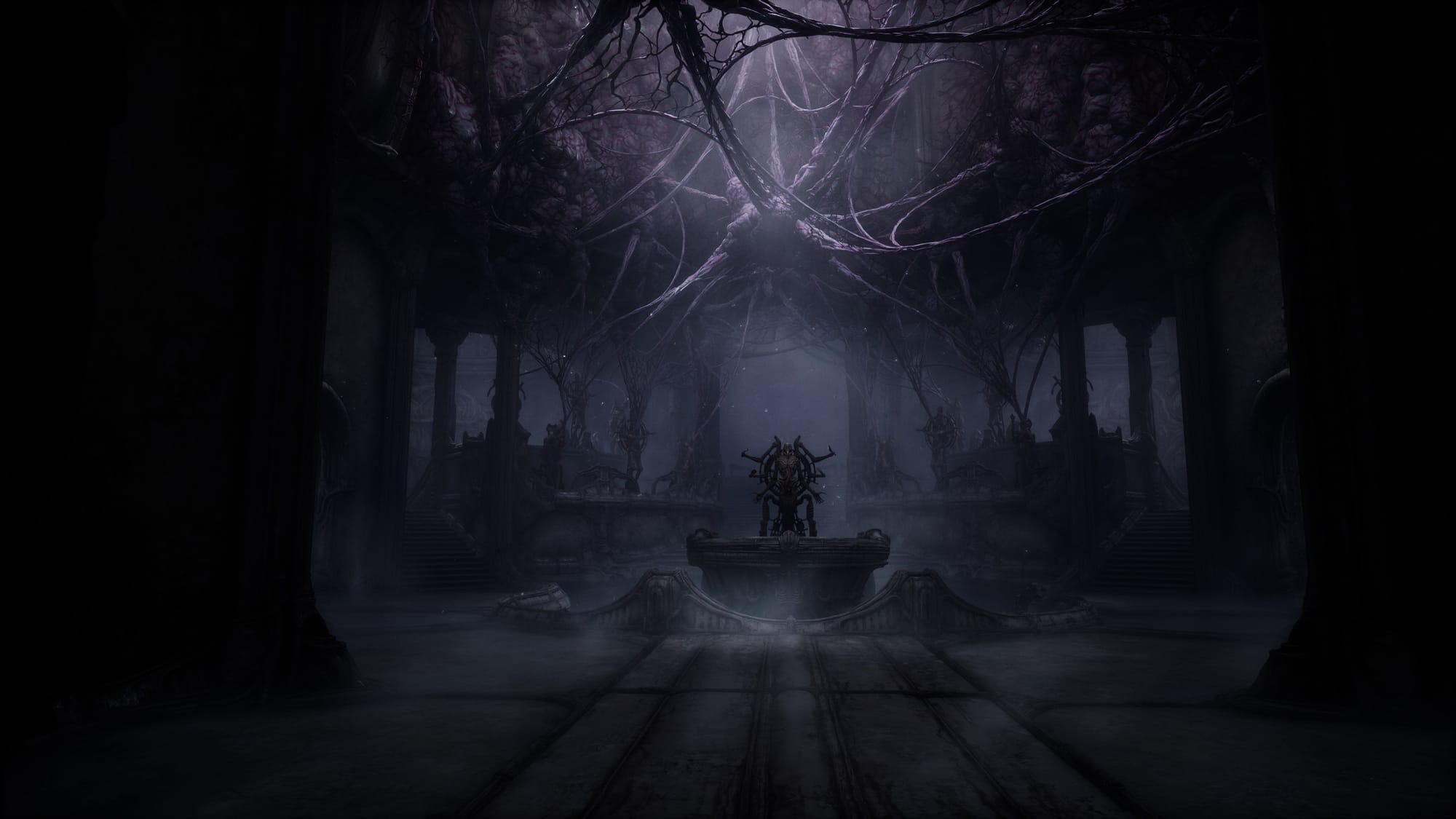
With all that being said, I see that many reviewers praise the game's atmosphere and to me this is where Scorn begins to fail. Good art does not equal good atmosphere. For a game, so many things need to coalesce to create an atmosphere that's notable. The art design, the layout of the game world, the sound design, the soundtrack, the players perspective, the story, the gameplay, the list goes on. The problem with Scorn is that it flops too many of these other ingredients to the point that the unique art design falls flat. It's a shame. Let's talk about it.
The Character's Presence
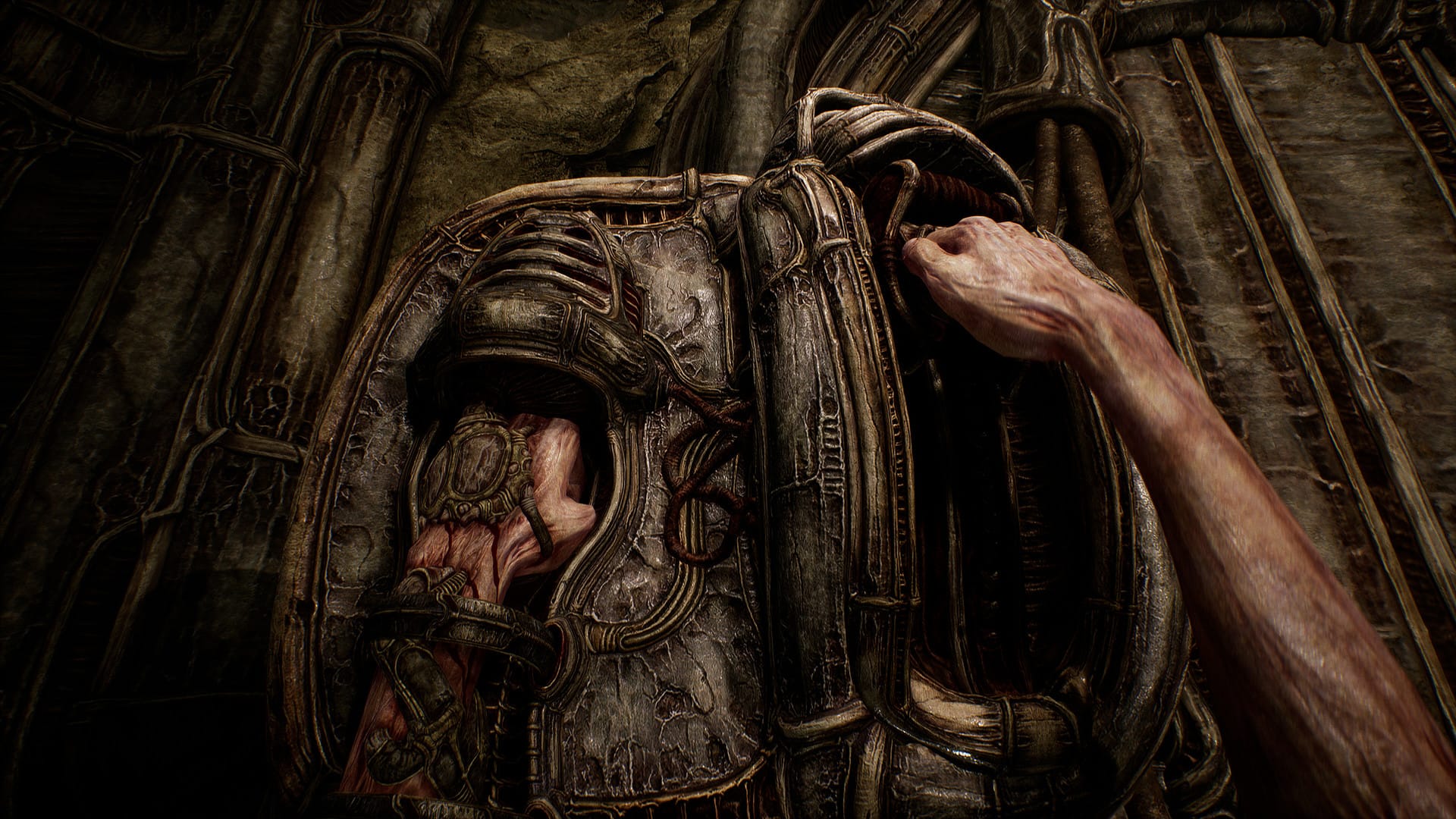
This one I feel like they fumbled on the goal line. There's obviously been a ton of effort put into animating your character's hands interacting with your equipment, different controls panels, and key items, but why didn't the developers take it a little further? First and foremost, a problem that bothered me from square one was the feeling of moving the character. It's super floaty feeling. It feels like a camera being pushed on dolly through the game world. Character movement feels so half baked. The footstep sound is so faint and doesn't adapt to the environment at all. This would be the perfect candidate for weightier sounding footsteps that squelch when trudging through organic matter or echo when walking through more polished halls. As far as I can tell, there's zero inertia to the character and the first-person perspective has no head bob at all. The floaty-ness combines with annoying floor geometry and no jumping to create all these annoying sticking points when transversing a level. We have all these lengthy and beautifully animated reload animations, but it feels like there was no thought given to how it feels to walk around, in a game where you do a lot of just walking around.
UI
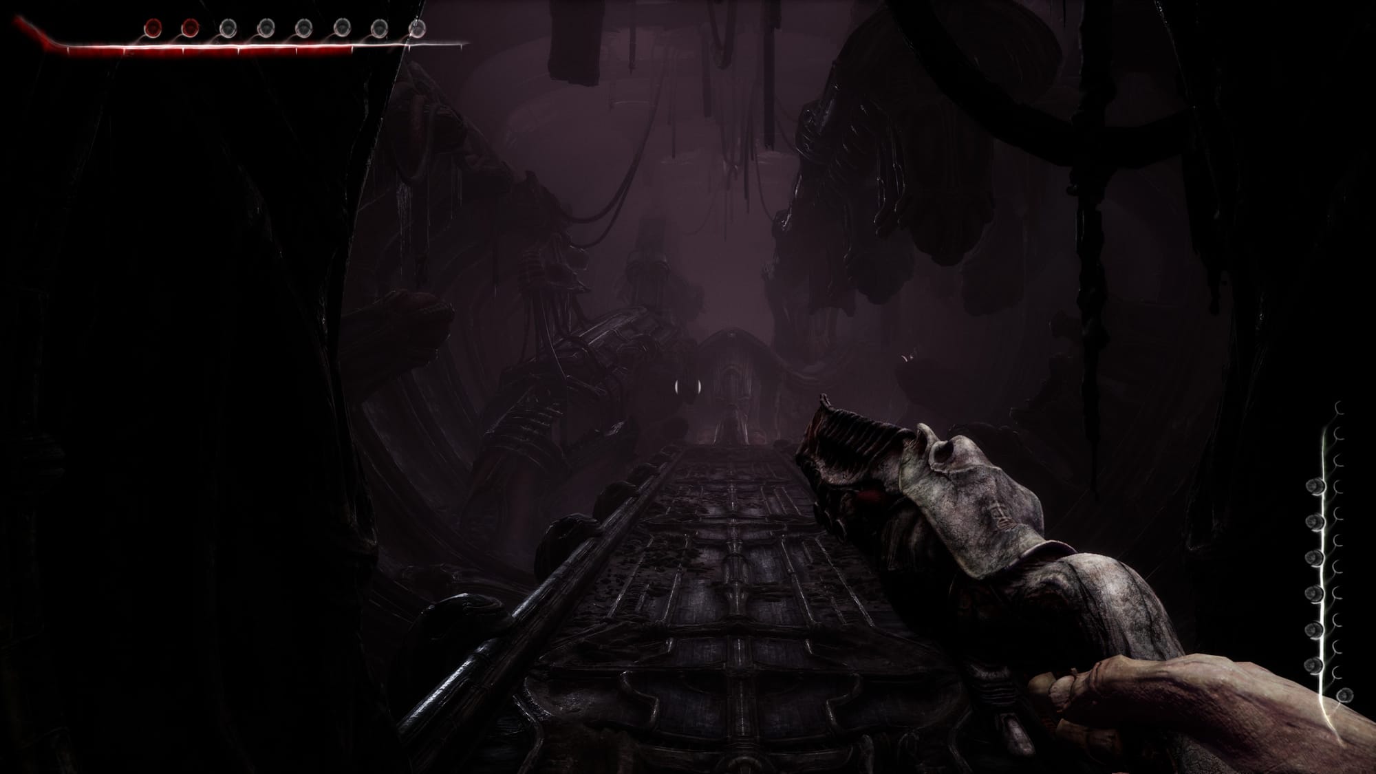
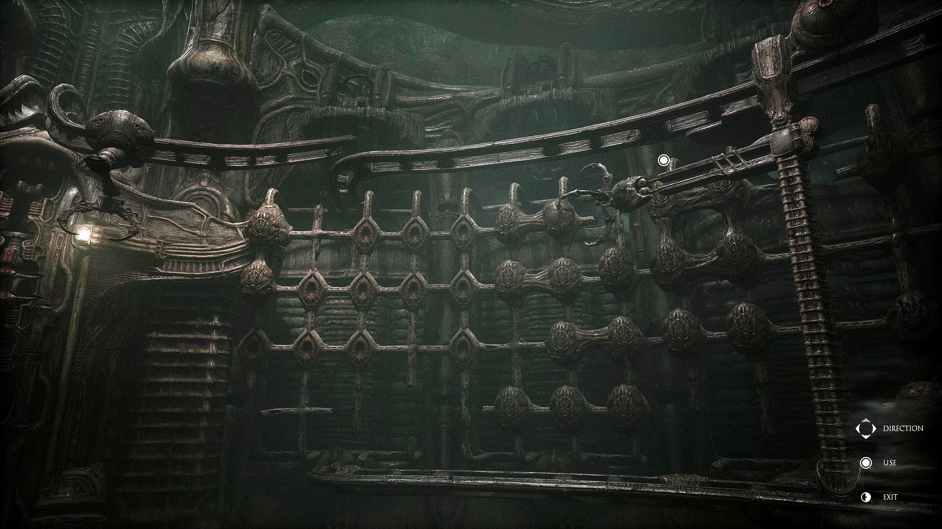
Again, it feels like the developers stopped just short of the goal line on this one. Why aren't health and ammo levels diegetic? The design for this stuff feels like it's all right there. You can look down and see your extra bullets and heals on your character. The pistol has those little yellow nodes right on the back, but they get covered up when it gets mounted back to your arm... The inventory view shows how many heals you have on you weird bulbous healing device thing, couldn't a HP indicator have been incorporated here? It's not a huge deal, but the rest of the game is pursuing this minimalist design aesthetic and then these UI elements show up when you get a weapon, and it feels tacked on.
The Soundtrack
Not much to say here. It's completely forgettable and mostly just ambient sounds. That can work, but this doesn't help when everything else isn't pulling its weight.
Narrative
Now this is a huge one. In the type of game where there isn't a lot of mechanical depth to the gameplay, what's driving me forward in the game world? In the past, I was pretty adverse towards narrative-driven games but came to realize that through a combination of excellent narrative design, atmosphere, world-building, etc., gameplay can take a backseat, see my SOMA analysis. So, now when I come into a game like Scorn, where I know, mechanically, the gameplay is going to be pretty light, I'm expecting something else to pick up the slack when it comes to answering that question of what's going to drive me forward in the game world.
Well, for Scorn, the narrative is not an answer to that question. Simply put, the narrative is nonexistent. I don't really know what to say here because there's really not much to go on. You're a weird looking humanoid, you get plopped into this alien world, and wander around, that's kind of it. There's no dialogue, no characters, no text anywhere, no audio logs, no inciting incident, no mystery, no drama, no nothing. And don't get me wrong, I don't need these things to enjoy a game, but with Scorn, I'm desperately hoping the game gives me a reason to care about it. The only progressive element to the game is that there's this parasite that's slowing taking more and more control of your body. The ending area starts to show you something more but that's too late! And I'm sure if you want to be a historian or archeologist, you can spend an hour in an area pouring over the environmental details and come up with some theories, but yeah, no thanks I'll pass.
Level Design
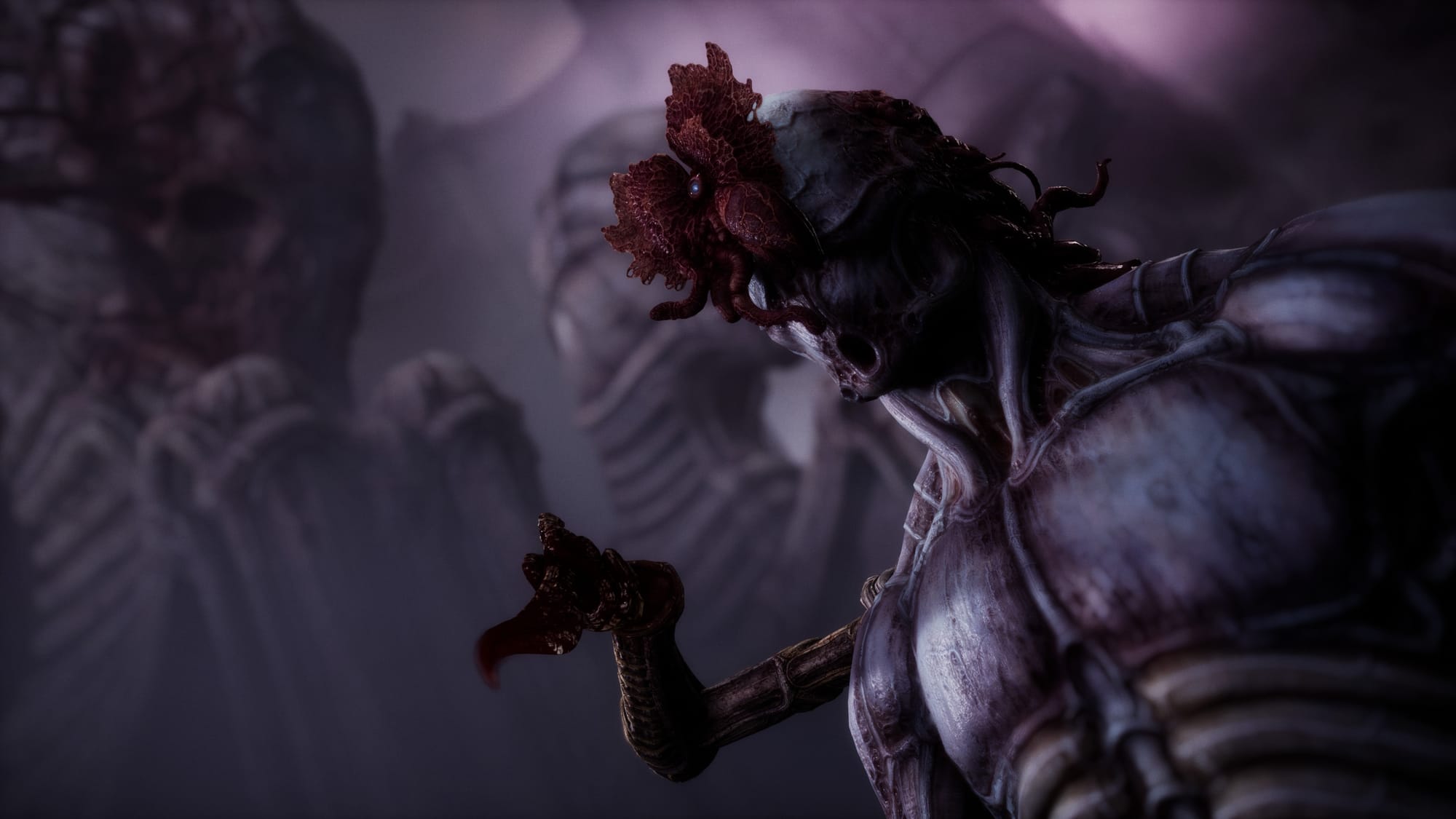
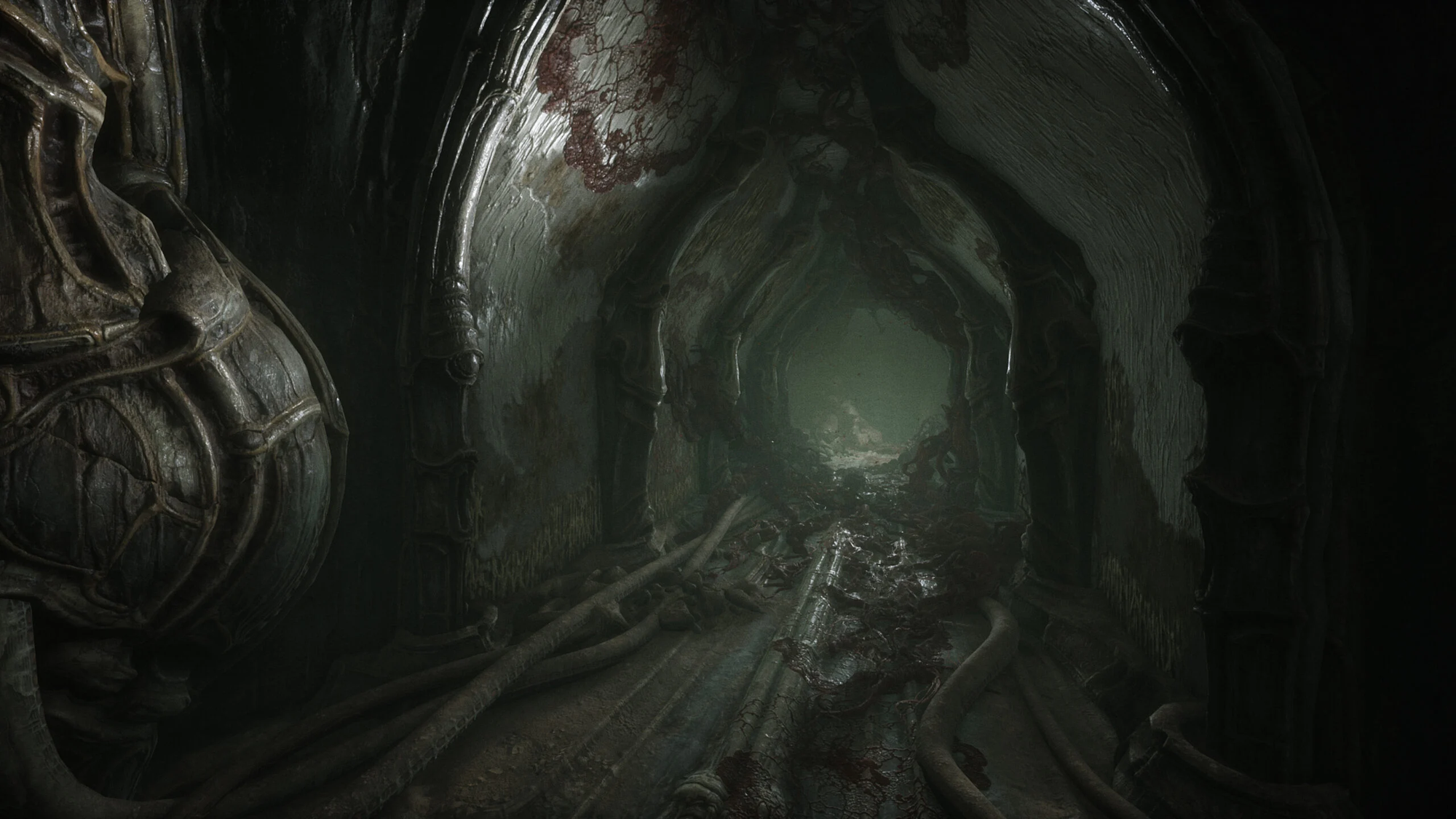
With no narrative and no gameplay progression, the level design would have to do some heavy lifting to save this sinking ship. Unfortunately, I think it's just mediocre and therefore the ship continues to sink. Scorn's levels are ones where you just meander around looking for something to interact with. There are no decisions on which way to go, no alternative paths, and the maps are too organic and weaving for the player to develop a real sense of place. That may be intentional, but it doesn't help me when I think back to what Scorn is or is not, what's enjoyable and what's not. Scorn, to me, takes place in these weaving halls that periodically break for a vista or puzzle. This isn't Resident Evil 2 where after 5 hours I've developed a mental map of the RPD, providing me a mental reference for the journey and corresponding emotions that accompany that location. With Scorn, it's all just too abstract. Remember that fleshy hallway where you pull that lever and the gates slides? As much as I like the architecture in Scorn, there's only so many brown hallways with piled up bodies of fleshy abominations I can take, before thinking, "is this all you got?". As much as I like the hand animations of your character in Scorn, there's only so many times I can watch their fingers slide into and out of those finger-holed levers before thinking, "is this all you got?"
Combat
The other elephant in the room is the combat. This one everyone seems to already know that it's a bit clunky and simplistic and I agree. I don't think it's a huge deal because for most of Scorn, combat really doesn't matter. You really only have this pneumatic piston thing and it's kind of a joke of a weapon. It's no fun to use, a jab would have more range and be way quicker, and there's only a handful of enemies. You eventually get some more conventional weapons and combat ramps up a bit, but it's never really fun and then the game is over. I do wish there was a way to holster your weapon. For most of the game your bulky weapon and arms take up the bottom fifth of the screen. Would've been nice to free up that space when out of combat.
Puzzles
There are puzzles and they are ok. I don't count walking around a level to find a lever a puzzle, so really there are only three or four in the whole game if I'm remembering correctly. They'll get you thinking a little bit and kind of fit the aesthetic. It's a little jarring to be playing that jammed parking lot game 15 minutes into this sci-fi horror experience, but whatever.
A Glimmer of What Could Have Been
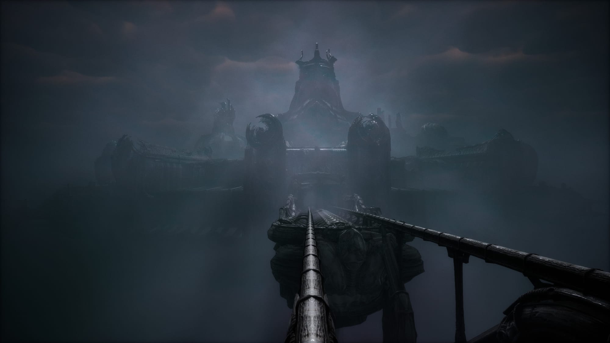
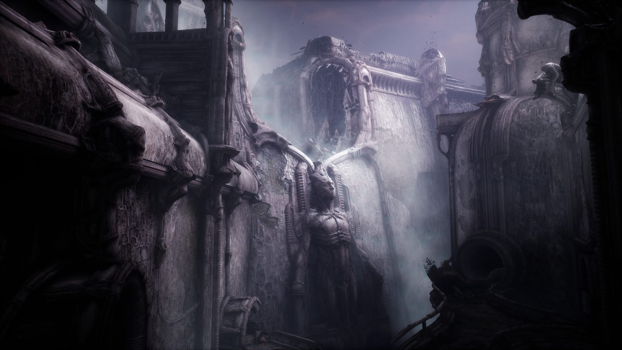
With all this being said, the last two levels tease what I could have been. Suddenly we have memorable level designs with a puzzle centered around tearing apart the body of a mammoth eldritch horror. Then there's intricate detail to the final level's architecture with sculptures and art around every corner. A notable track plays in the background too that adds some mood to this area. The combat, although still really rough around the edges, forces you to engage with it more. I didn't enjoy it, but at least there's some friction to the gameplay. All in all, while still not fully enjoyable, the final areas begin to reveal an atmosphere that just wasn't there for most of the game. One can only imagine what could have been.

Verdict
★★
If the developers of Scorn were to reopen development on Scorn and were looking for advice, my first suggestion would be to pick one of two directions. Either go back to the drawing board in all the aforementioned areas, keeping Scorn a horror game or strip it all down except for the art and game world and turn it into a 3D or even VR art exhibit. This in between effort just doesn't work as a complete game in my opinion. It feels like 90% of the effort here was poured into the art and 3D models and everything else got the other 10%. At least they succeeded in where they put their effort. The art design is so good at times that you forget how annoyed you are with the rest of the game and just revel in the majesty of it all.